How to Use Flexbox and Grid to Create Responsive Layouts
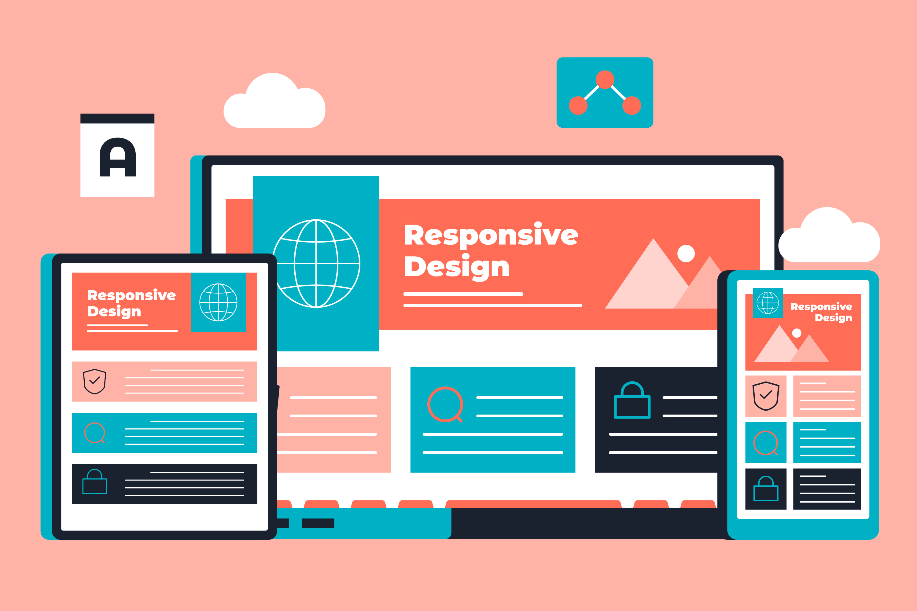
Creating responsive layouts is essential for any modern web developer. With users visiting websites on a variety of devices — from large desktop screens to small mobile phones — it’s our job to ensure a seamless experience across all platforms. The good news? Tools like Flexbox and CSS Grid make building these responsive layouts much easier. As a web developer, I can confidently say that mastering these layout techniques can take your web development skills to the next level.
In this guide, I’ll walk you through both Flexbox and Grid, explaining how they work and when to use each. We’ll also cover how these tools help you create flexible, dynamic, and responsive layouts that adjust perfectly to different screen sizes.
1. What is Flexbox?
Flexbox (Flexible Box Layout) is a one-dimensional layout model in CSS. It’s designed to handle the alignment and distribution of items within a container, either horizontally (row) or vertically (column).
Flexbox simplifies the process of aligning items evenly, even when their sizes vary. It’s perfect for layouts where you want content to flow smoothly on different screen sizes, like navigation bars, cards, and image galleries.
Key Concepts of Flexbox:
- Flex Container: The parent element that holds the flexible items. You can turn any container into a flex container using display: flex;.
- Flex Items: The children of the flex container. These items adjust their size and position based on the properties applied to the flex container and the items themselves.
- Main Axis and Cross Axis: Flexbox operates along two axes: the main axis (usually horizontal) and the cross axis (usually vertical).
Common Flexbox Properties:
- flex-direction: Defines the direction of the flex items (row, column, row-reverse, column-reverse).
- justify-content: Aligns items along the main axis (center, space-between, space-around).
- align-items: Aligns items along the cross axis (flex-start, center, flex-end, stretch).
- flex-wrap: Allows items to wrap onto multiple lines when needed.
Example: Here’s how you can create a simple responsive navigation bar using Flexbox:

In this example, display: flex; creates a flexible layout, while justify-content: space-between; ensures the links are spaced evenly across the navigation bar.
2. What is CSS Grid?
CSS Grid is a two-dimensional layout system, meaning you can control both rows and columns simultaneously. This is ideal for creating more complex layouts, such as full-page designs or responsive grid layouts for blogs, portfolios, and e-commerce sites.
CSS Grid gives you full control over both the horizontal and vertical placement of elements, making it powerful for creating dynamic, responsive designs.
Key Concepts of CSS Grid:
- Grid Container: The parent element that holds the grid items. You can create a grid container using display: grid;.
- Grid Items: The children of the grid container, placed into the grid's rows and columns.
- Grid Lines: The horizontal and vertical lines that divide the grid into rows and columns.
Common Grid Properties:
- grid-template-columns: Defines the number of columns and their width.
- grid-template-rows: Defines the number of rows and their height.
- grid-gap: Adds spacing between rows and columns.
- grid-auto-flow: Controls the flow of grid items (row or column).
- grid-area: Assigns grid items to specific areas.
Example: Here’s a simple 3-column grid layout using CSS Grid:

In this example, grid-template-columns: 1fr 1fr 1fr; creates three equal-width columns. The grid-gap property adds spacing between the grid items.
3. When to Use Flexbox vs. Grid
One of the most common questions developers ask is, “When should I use Flexbox, and when should I use Grid?” The answer depends on the layout you’re trying to achieve.
Flexbox is best for one-dimensional layouts: If your layout involves arranging elements in a single row or column (like a navigation bar or card layout), Flexbox is ideal.
Grid is best for two-dimensional layouts: When you need to position items in both rows and columns (like a full-page layout or a complex dashboard), Grid is the way to go.
Developer Tip: You can also use Flexbox and Grid together! For example, you might use Grid to create the overall page structure and then Flexbox inside individual components (like cards or buttons) for finer control over alignment and spacing.
4. Building a Responsive Layout with Flexbox and Grid
Let’s combine Flexbox and Grid to create a simple, responsive layout. Imagine you’re building a personal blog with a header, navigation bar, content section, and footer. Here’s how you can structure the layout:
Step 1: Set Up the Grid Layout
We’ll use Grid to define the overall structure of the page.

This creates a layout with a header spanning both columns, a sidebar, a main content area, and a footer at the bottom.
Step 2: Use Flexbox Inside the Navigation Bar
Now, let’s use Flexbox to align the navigation items in the header.

With Flexbox, we ensure that the navigation items are spaced evenly across the header.
Step 3: Make the Layout Responsive
We’ll use media queries to make this layout responsive. When the screen size is smaller (like on a mobile device), we want the sidebar to collapse underneath the main content.

Now, when the screen width is below 768px, the layout will switch to a single-column format with the sidebar beneath the main content.
5. Why Flexbox and Grid are Essential for Responsive Web Design
As a developer, your goal is to create layouts that work seamlessly across all devices. Both Flexbox and Grid give you the flexibility to build responsive designs without relying on heavy frameworks or complicated workarounds.
Flexbox excels at handling small components and one-dimensional layouts, while Grid is perfect for larger, two-dimensional designs. The best part? You can combine them for even more control and creativity.
Final Thoughts
Mastering Flexbox and Grid is key to becoming a more efficient and effective web developer. These tools not only make it easier to create responsive layouts but also give you greater control over the design process. Once you’re comfortable using both, you’ll find that building flexible, dynamic layouts becomes second nature.
If you’re new to Flexbox or Grid, don’t worry—it takes practice, but the payoff is huge. Start by experimenting with small projects, and soon you’ll be able to build complex layouts that work beautifully across all devices. Happy coding!